
You are hereForums / General Discussion / BMORC Chat / BMORC 05 Jerseys (first concepts)
BMORC 05 Jerseys (first concepts)

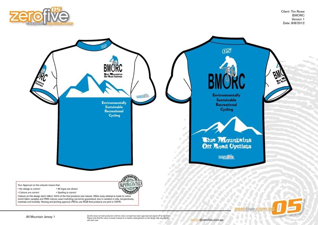
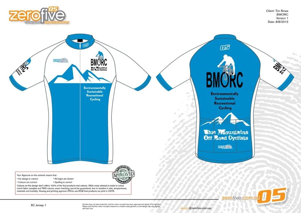
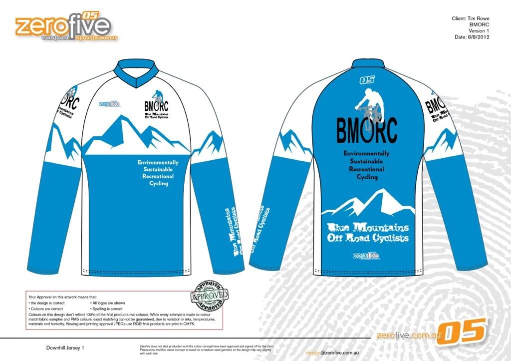
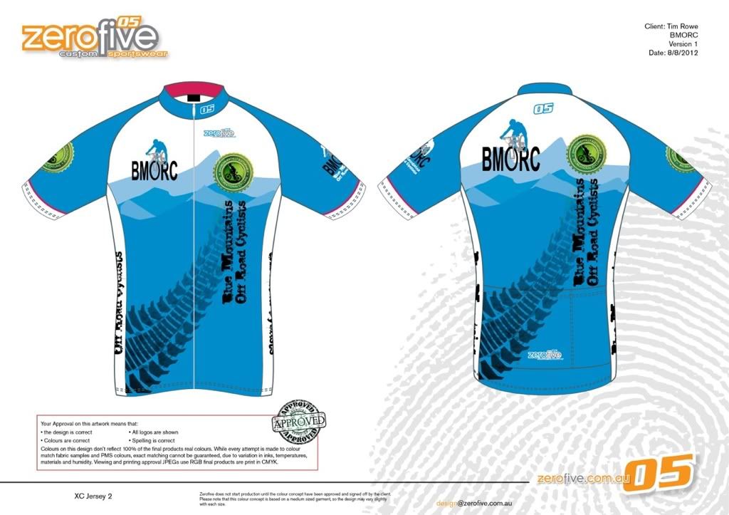
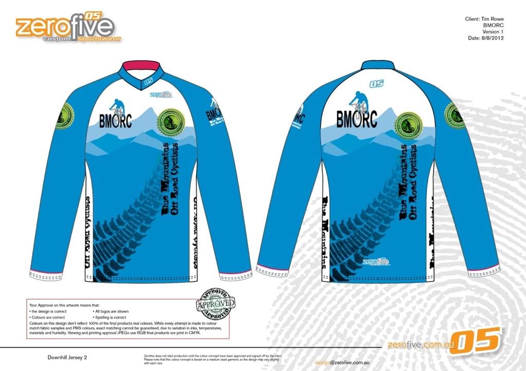
Ok, here are the first concept designs for the AM, XC & DH jerseys. Let me know what you think. Personally I'm liking the second set. But not a fan of the green.
- Login to post comments
- Bookmark & share
Tags
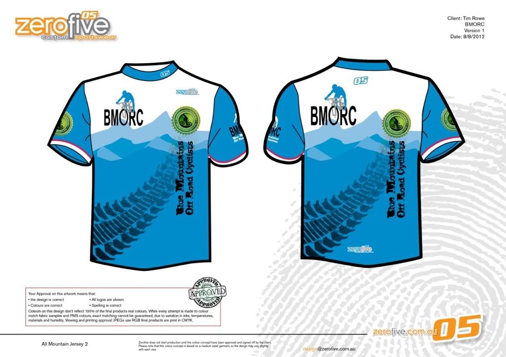
I like the second with the tyre track through it.
I like the second with the tyre track through it.
1st and 2nd set with mountains in background, looks identifiable!
Love them!
I like the first mountains ones... may hide my not so muscular torso better too.
I like the tyre design but I don't know what the little green medallian thing is? That looks a little too foreign to us!??? Maybe without the medallian?
I've now received the DH jerseys and updated the OP.
Tonight or tomorrow I'll send of an email with changes we would like to see made to the concepts.
At the moment it's just the removal of the green emblem.
If you havent noticed, in the second set he has also included a red line at the end of the arm sleeves similar to the spokes in the banner, what do you think.
Noticed the red... I like the tension of the red and blue more than blue alone. he could even fatten it up a bit.
What was the green emblem... too small to see it in the pics. Having something there looks alright but we would need something that meant something and we don't have such a something.
From what I've been able to make out, its a chain ring with cyclist in the middle with "Environmentally Sustainable Recreational Cycling" around the chain ring. I have asked for a higher resolution sample of the logo.
I like the tyre one without the medallian, but the back is the same as the front which is a little poxy. If the back of the tyre one had the text and BMORC logo like the top mountains ones over the tyre mountains that would be cool. Keep the bit of red in there and I would be happy.
Don't really like the green medallian either way.
I like the tyre track design, and the red bit should stay.
Make the green logo red I reckon..
I think go with the front of the second lot, without the green round thing, and have the back of the jersey with the first back design. If that works?
Ok, here is the green logo. Now seeing it I don't mind the logo itself but if we used it I'm thinking one sleeve only.
I kinda like the green medallion.
Just in case anyone miss reads my last post. One Sleeve only meant not on front or back.
What about full red bands on each sleeve. Much like the BMC team jersey.
I was thinking a little bigger also, but was thinking an Inch maximum.
2nd for me with the chain ring on the sleeve only.
up to 1" was my thinking, it makes it stand out more.
Like the look of the 2nd AM jersey with the tyre tread through it. Def like the idea of the blue and adding red in it and even the green to a degree...gives a bit of contrast