You are hereForums / BMORC News / New Banner!!!
New Banner!!!

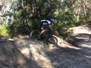
Well finally after 2 years we have a new banner and we can get rid of the one knocked up really quickly just because we needed a website.
Tim or ChopStiR got dumped with the task and he spent some time getting inspiration and at the build day got some. He presented this the other day and everyone just went yep!. It also includes his logo so that ties it all together nicely.
The sandstone in the picture is from the creek crossing we built the other day at Knapsack so there is a sort of tie in to us putting our wheels down on the trails we lobbied for.... or really its just snazzy!
So thanks Tim!
- Login to post comments
- Bookmark & share
Tags
This has been an on and off project for several months.
Im really pleased with the results. Just for fun, here is what the guys rejected and for good reason
Where is it??
Do a refresh in your browser Todd.
Yeah, it didnt show up for me also until I reloaded and then it didnt appear for another 20secs.
Great job Tim.
Got it, must agree, that that looks great, instead of going with computer imaging etc, one simple photo conveys its message, fantastic i say, still i think the logo looks very basic beside the photo, i see it in my job everyday, i think we need to get a different design, but keep that photo, the photo really puts the logo into the shade!
glad someone asked
i thought i must have gone blind after seeing the photo of mogg dealing crack
looks heaps better
i agree with todd on the logo though
Feedback, feedback, feedback please!!! How can the logo be improved or changed. Give me your ideas!!! What parts do you or don't you like? Colour, bike rider, text...the more details and the more specific the better. Personally I love it but that's a bias opinion
See I like the logo because it looks like something from the late 90s rather than some whizz bang super slick one from nowdays... sort of retro (not that the 90s are retro.. or are they?.. damn I am out of touch with da' youth). Makes us not look so flash in the pan.. also looks good in the header of documents and on clothing because it has a retro feel.
I know with you Todd you get to see the highest end graphic artwork all day done by the best of the best... so things will stand out with you.
But really if some new one comes along where we just go whooah that's way cool then heck we can change it.
Firstly Tim, I like it.
But...
I know the previous banner was "just knocked up", but I liked it as well.
The thing I liked about the previous banner was that it suggested things that are special about riding in the mountains. I'd look at that banner and think "wow, what a great place to ride!" The new banner is great, but there is nothing that suggests Blue Mountains about it. Is that important? I don't know. Perhaps.
Anyway, on to the current banner. I think the text "Blue Mountains Off-road Cyclists" underneath the logo is the part that could be improved the most. The font is very small, and actually renders quite scratchily on my resolution. I know that it's hard to fit all those letters into that tiny space, but I don't think that we even need the text under the logo. We have this information right on the top of the content area of the home page: "The Blue Mountains Off Road Cyclists. Environmentally Sustainable Recreational Cycling."
Any new visitor who doesn't land on the home page first (e.g. links into a sub-page via a web search), can easily go to the home page to see what the site is about.
While we're on the home page, can we put a hyperlink to the home page on the banner image? Most people expect to click on a site's logo to take them home these days.
Also, I would reduce the fade to white effect a little. Too much white around the logo. The logo looks too segregated from the photo, for mine. Maybe get some more of the photo fading back in in the top left corner.
But great work Tim. I'm happy with it, but you asked for some improvement suggestions, so there are mine.
Mark,
i might see if i can get somebody to try some designs, my first thought would be to either keep that photo or as Jim said, something very Blue Mountains, like a picture of a tyre and wheels as what we have with maybe a Blue Mountains icon in the background( like a part of scribblies, even lockyers, winmalee, whatever), but with the logo, you reverse it out of the photo somewhere, reverse bmorc in the photo with some bordering around the lettering, this is easy to achieve, the photo itself would have to be set up!
This look is not fandangled, it has been happening for 40 years now, basically timeless, the thing is, no matter what money or how high end designs are, the ones that work are simple and sometimes black and white!..the fancy ones work sometimes, it comes down to design, problem with the banner is you have a great photo with a simple logo that does not fit into that banner in any way, it fades to white from a colorful photo and looks like its there by accident!
Banner looks great Tim.
Great concept, great photo. Looks really good.
I like it ... and I also like the other one ... Can we have the banner cycle between the two (Sorry to be difficult) ... say every login
In the end it doesn't really matter ... BMORC is about the people in it, riders wanting to make a difference be it to change the perception of what Riders are, Influence facilities and the quality of the trails we ride, or share the passion with other like minded people.
The New banner does get my trail building and ride mojo flowing though